Natural Climate Change What is natural climate change? By Floor Anthoni (2011)
www.seafriends.org.nz/issues/global/climate7.htm
This important chapter is dedicated to the
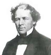
late Dr Joseph O Fletcher who made some astounding discoveries about the
main drivers of climate, in a quest to understand what is natural and what
is not. From sailors' data going back to 1854, it became evident that winds
change strength and that this has a major influence on climate everywhere,
even on sea levels. Indeed the observed and feared climate change can entirely
be explained this way as also predictions can be made.
When we want to understand natural climate change, we must go far back
in time and look for a signal that is found everywhere over every ocean
while completely consistent and in accordance with observed climate changes.
What could that be?
Global circulation is easily explained in theory but Earth's geography
throws a spanner in the works, such that it is not possible to understand
Earth's natural climate without understanding the enormous differences
between the two hemispheres.
introduction This global climate chapter is very exciting because it deals with
an important mechanism that has been overlooked or insufficient attention
paid to. It is based on the work of the late Dr Joseph 'Joe' C Fletcher,
known for his arctic research. Working for NOAA, he was OAR Deputy Assistant
Administrator for Labs and Cooperative Institutes. Joe retired in 1993
and moved to Sequim WA where he passed away on July 6, 2008.
Dr Gary Duane Sharp was a good friend of Joe and even organised a seminal
lecture as part of his Maestros Legacy Lecture Series. This 100 minute
lecture was filmed, and I proposed to have it transcribed
and converted to HTML, for the world to read in perpetuity. Don't miss
it!
Joe's personal quest was to answer the question: "What is normal global
climate change", based on the hypothesis that:
Nature will behave as it has in the
past and will continue to do so. - Joseph Fletcher
To
investigate this, he based his research on the COADS dataset (Comprehensive
Ocean-Atmosphere Data Set) held by NOAA, to which he had access. This dataset
was begun by a far-sighted individual, Matthew Fontaine Maury (1806-1873)
who at that time headed the hydrographic office and built the sailing charts
to help mariners sail at various places around the world. He realised the
value of accumulating a dataset which would really document the behaviour
in all the oceans. So in 1854 all the participating countries agreed on
when to take observations, how to take them, how to archive them and so
on. And this has been going on now for almost 150 years up to the present,
resulting in over ten million observations which provide us with a good
documentation of just what has been happening at the ocean's surface in
all parts of the global oceans.
.
The
complexity of the climate system has been described by many people including
such great scientists as Einstein and Von Neumann, pointing out that the
ocean drives the atmosphere, and the atmosphere drives the ocean, and
that the interactions occur on all time and space scales, with nonlinearities
and thresholds and that the representation of all these interactions, are
almost beyond comprehension. The simplicity is that nature knows all the
rules, and knows all the boundary conditions and knows where the mountain
ranges are, deep ocean ridges and trenches, and the rest of the geography,
and nature's answer to that question is this average picture of winds (wind
field). When you think of it in a holistic sense, you can think, if
whatever is forcing this system, if it changes in magnitude, you can expect
that the whole pattern will wax and wane in unison. And that is exactly
what the observed record is showing as here with the wind field.
As the forcing increases, the highs become higher, the lows lower, winds
stronger, and vice versa.
The simplicity is that nature knows
all the rules, and knows all the boundary conditions and knows where the
mountain ranges are and the rest of the geography. - Joseph Fletcher
Not surprisingly, this is precisely what this chapter aims to do. First
we'll look at some of the most popular signals like ENSO, AMO, PDO, to
conclude that they do not make it. But what Fletcher discovered was the
consistency and the enormous change in the wind field (wind speed), and
this needs further study. But already major predictions (that have come
true) can be made.
To understand the winds and barometric pressures, we need to understand
the general global circulation and the differences between the two hemispheres
which creates an entirely different situation.
Joe Fletcher pays much importance to the Tropical Warm Pool, and how
it works as the greatest climate phenomenon on Earth.
In the end, we do not know where the main fluctuations come from,
but it must be either from changes in sunlight or from an irregular out-radiation
of Earth.
To begin with, one must understand that there are major and important
differences between sea and air, as shown below. Thus the sea is Earth's
main heat storage whereas winds are its main weather and climate motor.
property
oceans
air
description
heat capacity
mass
momentum
kinetic energy
1600
400
4
0.04
1
1
1
1
Very large volume times
high specific heat capacity
Atmosphere only equates
to 10m depth
Speed times mass
Ocean currents are slow
and superficial. Winds are fast.
The conclusion is that Joe's hypothesis is probably right, as one does
not need Anthropogenic Warming to explain what happened in the past 150
years during the Industrial Revolution, because the changes in wind strength
explain it all.
Winds also have a major influence on sea levels, year to year, decade
to decade and on a century scale. Because modern sea levels are derived
from satellites that do not measure the polar seas outside 66º N and
S, a crucially important part of the oceans is excluded from observation.
Finding the
global signal One can say that the Anthropogenic Global Warming (AGW) fear is based
on a truly global signal, the concentration of carbondioxide in air, which
can be measured everywhere, with the same or similar results. Such a signal
must influence the climate everywhere in a similar way (warming), but this
has not been found. Global temperature has been swinging but not in rhythm
with the CO2 signal. So could there be another signal, also global in nature
but more in tune with observed temperature swings? In other words, does
a global signal exist that explains all natural temperature swings? For
it to have any meaning, it must be found everywhere with the same characteristics,
and also be reliable and extend far into the past.
In
this graph we have brought some global signals together, that are on and
off the flavour of the time. All signals have the bottom axis as zero,
except for ENSO, AMO and PDO which are relative to the brown scale on right.
There is ENSO (El Niño Southern Oscillation) also called SOI (Southern
Oscillation Index), here the purple scribble, which is derived from a difference
in air pressure from east to west equatorial Pacific. Due to local barometric
pressure swings, it is very noisy, but related to how much water is pushed
into the Tropical Warm Pool in the west equatorial Pacific, even though
it does not swing in unison.
Related to this is the PDO or Pacific Decadal Oscillation, the temperature
swing of the North Pacific basin, here in dark brown, and not at all corresponding
to the PDO. For good measure the AMO (Atlantic Multidecadal Oscillation)
which is the temperature swing of the North Atlantic (in light brown).
Again, poor correlation. [Note that the AMO should really have been called
ADO for Atlantic Decadal Oscillation, because another AMO Atlantic Meridional
Overturning, also exists.]
Reader note that the average global temperature is not shown here because
it has been corrupted to such extent as to be entirely unreliable.
The Tropical
Warm Pool in light red, represents the pool of water warmer than 29ºC
and because of this, capable of causing thunder clouds and deep convection
into the highest reaches of the troposphere, transferring a massive amount
of latent heat into the atmosphere (see later). The red curve above is
its average, but is unreliable before 1900. Notable is the extreme rise
between 1970 and 2000 from 100 to 170 (lefthand red scale), or an unbelievable
70%, which is hard fact.
The green
squiggle in the graph above, represents the surface wind strength in the
South Indian Ocean, the world's weather power house. Winds here blow on
average at 9m/s (20MPH, 32km/h), with substantial year to year fluctuations
and a huge 150-year swing of 30%. The average wind speed over oceans is
6.5m/s with enormous geographic variation as the wave height map shows.
Remember though, that wave height is proportional to the third power of
wave wind strength. The map shows very calm areas in magenta and the Warm
Pool as poor in wind. Notice also tall waves near Canada and Greenland.
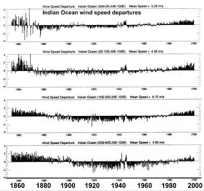
Also shown in the global signals graph is the average of the Indian
Ocean (partly shown), which follows the southern winds in phase and pattern.
The question is now: what about the other oceans?
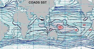
Sea
Surface Temperature (SST) maps are usually shown in false rainbow colours,
but when their isotherms (points of equal temperature) are plotted, a picture
emerges with more information as shown here. Where these isotherms are
close together, a steep gradient exists, inviting strong winds and a highly
variable climate. Fortunately nobody lives in the Southern Ocean south
of Africa, but in the NH three areas are battered: east Canada, Japan and
west Mexico. Please note that these curves were not obtained from satellites
but from actual measurements on ships (COADS).
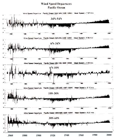
150 years of wind for (LtR) Atlantic, Indian and Pacific oceans. [Click
on an image to see a larger version]
The sea wind is indeed a universal global signal because all oceans follow
the same pattern and the same deviations for over 150 years. The wind signal
is large, because the 150 year swing[see
box below] of 25-30% is equal to a swing in solar forcing of
30-50W/m2, whereas the world is in panic about 3W/m2 in a century (IPCC)!
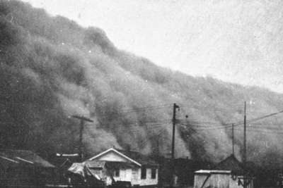
October 2012
dust storm over central USA Dr
Fletcher calculated the periodicity of the wind cycle at 170-180 years
but on 19 october 2012 a massive dust storm over central USA reminded us
of the "Black Sunday" dust storm of 14 April 1935, suggesting a periodicity
of 77 years (about half of 150), and a repeat of the "dust bowl" droughts
of the 1930s with severe loss of topsoil and harvests, for years
to come.This occurs just as a large part of the corn harvest is diverted
to ethanol production.Note that another recent dust storm happened in Arizona
on 5 July 2011.
[1]: Scientific American Oct2012: link [2] wikipedia
Black Sunday storm [3] The Daily Times: link.
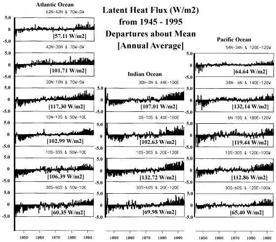
The
latent heat flux (=flow) in all oceans (1945-1995) follows the same
pattern and is also a global signal. [click for larger picture] Note that
heat flow (flux) from the sea is mainly latent heat (evaporation),
which depends on both temperature and wind speed. In the cold seas it is
around 60W/m2 and in the tropics 100-130W/m2. Protagonists of AGW would
say that these graphs are a sign of global warming, ignoring that winds
have followed the same pattern and that evaporation is proportional to
wind speed.
Between 1977 and 2003, average ocean
evaporation increased by 11 cm per year from 103 to 114 cm per year (10%).
This was caused by an increase in average wind speed of 0.1 meters
per second [Yu, 2007].
But hang on, one cannot have such large swings in energy without also a
corresponding swing in sunlight. Since the sun is considered a constant
light source with, give or take, 0.1W/m2 fluctuations (the solar constant),
what is the story? Remember that sunlight arrives with an intensity of
1368W/m2 which averages out at 342 W/m2 due to day/night and summer/winter.
So 30 W/m2 variation is enormous. Is that reflected in climate and weather,
temperature and wind?
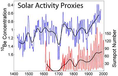
There
exists as yet no reliable method to measure past fluctuations in sunlight
arriving at Earth's surface, even though the new radioactive Beryllium-10
method looks promising [1]. The very light metal Beryllium occurs
in the atmosphere as it is created from cosmic bombardment of larger molecules
like nitrogen. As it dissolves in rain drops, it settles out on Earth's
surface where it gets enclosed in ice and sediments. But the technique
is young, its signal small and its interpretation uncertain. In the graph
(Beer et al. 1994) is also shown the sunspot activity (Hoyt and Schatten
1998), which in 1650-1750 caused deep cold (the Maunder Minimum or Little
Ice Age). A new minimum after 2010, appears to be coming. Note that these
curves are not in agreement with the wind pattern.
But who says that Earth's reradiation out to space is constant? Perhaps
the energy is obtained by not reradiating as much back into space, which
could be caused by an inherent instability of the climate cycles like:
more wind => more evaporation => less IR out => more warming => more
wind
and the reverse, winding it down again. The frequency of such an oscillation
depends on the inertia of the whole, in this case the oceans. Then a +30%
and -30% cycle in 170 years amounts to only 0.3-0.4% per year which is
indeed undetectable.
Some
support for the notion of reduced Outgoing Longwave Radiation OLR comes
from a computer model by Pierrehumbert, the results of which are graphed
here. Horizontally the temperature of the surface in Kelvin, and vertically
the outgoing IR radiation. rh means relative humidity. The top solid black
line treats the surface as if it were a black body, radiating out according
to the Stefan-Boltzman equation. If the air contains moisture, OLR reduces
because water vapour absorbs OLR. The more water vapour, the less OLR.
Note that 273K is 0ºC and the Warm Pool of above 29ºC is to the
right of 302K. Here moisture can make a 30% difference, supporting the
notion that increased winds, cause increased evaporation, causes less OLR
and more warming of air. Thus OLR can vary considerably over time and place,
and is definitely not constant. In theory, changes of up to 30% can even
happen on a yearly basis, but is not likely. Smaller yearly changes become
more likely.
Reader please note that the above graph comes from a computer model which
assumes that the surface cools by re-radiation and evaporation, which is
false. It just subtracts the heat of evaporation from the Stephan Boltzman
black body radiation. But the surface cools mainly by conduction and convection,
plus evaporation. The above curves are still useful to see how quickly
evaporation becomes significant as the water warms above 300K. Note also
that the effect of wind is irrelevant in this graph because it is only
about heat transfer. The effect of wind is mainly that the bottom curve
(saturated air) becomes dominant.
So the bottom line is that we cannot show where the energy came from
to cause such large swings in wind strength. We just need to accept for
now that it is real and not altogether impossible, and figure out how the
rest of the climate system reacts.
We can already predict that faster winds cause:
faster transport of heat over the world and deeper into the continents,
through the atmosphere.
faster ocean currents and heat transport through the seas.
ocean currents breaking up and transporting the Arctic ice sheet ('Arctic
melting')
rising sea levels because Antarctic westerly currents push down the Antarctic
trough while pushing up the sea level everywhere else down-wind ('rising
seas'). See Chapter4/sea_levels.
more evaporation because evaporation is primarily proportional to wind
speed: more wind, more water vapour.
more rains, snow and clouds that also reach deeper inland.
less droughts. Thus overall better conditions for farming.
cooler sea surface because evaporation cools the sea.
warmer air because when vapour condenses to cloud, heat is transferred
to the atmosphere. ('global warming')
Note that all these symptoms are also claimed for global warming.
From the graphs we can also predict:
before 1900 the world was a wetter world with good crop growing conditions.
during 1920-1940 the winds were slowest, corresponding with the Dust Bowls,
universal droughts and famines.
we've come to the end of fast winds and begin to dip towards slower wind
speeds.
the right side of the graph almost joins up with the left side. It is a
large cycle (174-year, see further) and we can expect a repeat of the 1850s.
[1] More about radio-dating with Be-10 in Chapter
3.
Differences
between hemispheres The world's climate system cannot be understood without understanding
the differences between the Northern Hemisphere (NH) and the Southern Hemisphere
(SH), neatly summed up in the table below..
North Pole, the Arctic,
N hemisphere
South Pole, Antarctica,
S hemisphere
Is an ocean surrounded by
continents
Is a continent surrounded
by oceans
Has sea mounts and ridges
under water and a very large continental shelf (light blue)
Has mountains and volcanoes
and a very small continental shelf.
Has very slow ocean circulation
Has very fast ocean circulation
Annual mean temperature
is 0ºF=-18ºC
Annual mean temperature
is -60ºF=-50ºC
Human population north of
60ºN is more than 2 million
No human population
Sea ice area 7 million square
miles
Sea ice area 6 million square
miles
Westerlies more variable
and not strong
Very strong circumpolar
westerly winds and currents
Northern Hemisphere has
most land
Southern Hemisphere has
most water
Has many huge mountain ridges
blocking winds while partitioning the troposphere
Has only one mountain ridge
blocking winds, the Andes
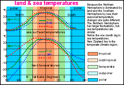
Here
the global climate zones are shown in colours from left North Pole to right
South Pole. Superimposed are temperature curves for the northern summer
(red), average (green) and the southern summer (blue). Although both hemispheres
behave quite similarly, it can be seen that the NH warms up in summer more
so than the SH, while also becoming colder in winter, even though average
temperatures are quite similar. In simple terms, the NH has a land climate
(more extreme) and the SH a sea climate (more equitable).
This
diagram simplifies global atmospheric circulation as if it were symmetrical
for both hemispheres. Around the equator, trade winds blowing E to W converge
to a weak equatorial E-W flow and corresponding ocean currents (ITC= Inter
Tropical Convergence). The convergence (clash of winds) causes air to rise,
releasing heavy rain, travelling poleward and descending in the subtropic
highs as very cool dry air, creating the desert zones of the planet. This
is called the tropical Hadley circulation which spirals E to W around both
sides of the equator. There is a counter flow in the upper troposphere
in the form of jet streams. In the temperate climate zone, winds are dominated
by the Coriolis force which deflects to the right on the NH and to the
left on the SH. The winds here are mainly westerlies and they are very
strong. Finally around the poles exist the polar Hadley cells, with strong
winds spiralling around the poles in an E-W direction. We will now see
that this narrative is not true in the real world.
This map shows the average situation for the northern summer. A deep low
exists over east Asia and persistent highs over both oceans. The mountain
ranges separate the Asian low from the Atlantic high but cause strong winds
on the Pacific side. On the SH there is basically only one deep low over
the Antarctic and (4) highs circulating around it. Note that the Intertropical
Convergence (clash of winds) runs just north of the equator on the west,
but very far north over Africa, India and China.
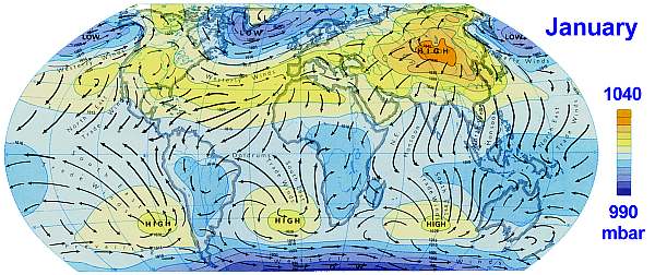
The situation in the northern winter is quite the reverse as Asia now forms
a large high and deep lows are found in the far northern oceans. However,
Antarctica remains a deep low with three highs stationary over each ocean.
Notice that the ITC is in about the same place in the west from the Pacific
to Africa, but then descends steeply towards south of Indonesia and north
Australia. Thus in the east, the ITC has its largest latitudinal
swing with reversing winds, creating the fertile monsoon climate. The only
places where winds consistently blow in the same directions are the South
Pacific, South Indian, South Atlantic and around Greenland. Not surprisingly,
we find the strongest winds here and the highest waves.
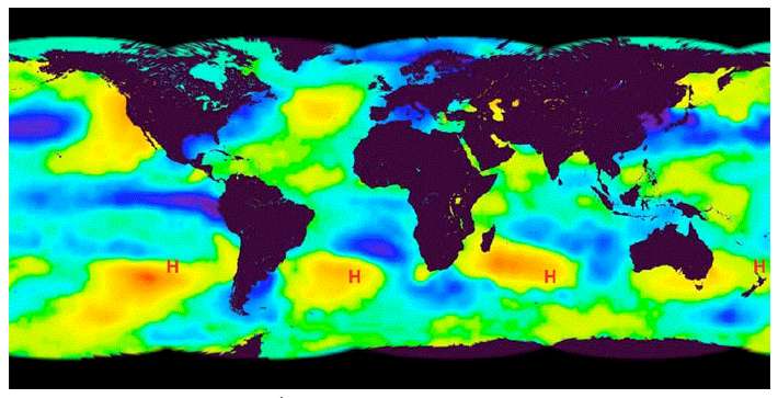
The above map shows Sea surface temperature (SST) anomalies for 25 Jan
1981. Warmer-than-usual water corresponding to high pressure areas. It
is thought that these are caused by lunar standing waves in the atmosphere.
link.(interesting
and new)
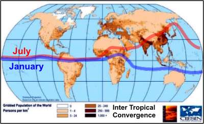
The
map shows where people live, and their densities. It also shows the extent
of the Inter Tropical Convergence zone which travels from the July curve
(northern summer, red) to the January curve (northern winter, blue) and
back each year, with variations in its extent. Where winds meet, air rises,
causing rain. The ITC is essentially a rain band, which means that the
people living between red and blue bands, experience two rainy seasons
each year, which is most beneficial for agriculture and thus for humanity.
About half the world's population lives here (dark colour).
The other half lives in the temperate zone where annual evaporation equals
rainfall, thus retaining ground moisture for agriculture. In between these
two areas extends an arid zone where few people live. To the north (60ºN)
and south (50ºS) it is too cold for plant productivity, reason why
very few people live there.
Looking
at average barometric pressure, a huge difference is found between the
two hemispheres. The graph shows how the northern winter and summer do
not differ very much but south of 40ºS, barometric pressure tumbles
into a consistent ever-present deep Antarctic low. This steep gradient
forms perhaps the motor of the world's climate system, with very strong
winds unobstructed by mountain ranges..
When
the above barometric pressure is plotted as differential pressure between
latitudes, it looks like this bar chart, the blue bars for the NH summer
and the red bars for winter. The differences in barometric pressure, or
the gradient in pressure, is what drives the winds. As one can see, the
Southern Hemisphere has a huge wind field compared to the Northern Hemisphere.
Strongest winds occur around Antarctica in the southern winter JJAS.
These two graphs from Fletcher show another dramatic difference between
the hemispheres. The blue curves correspond to the northern summer and
the black dashed curves to the winter. Potential energy corresponds to
sunshine which has a predictable swing for the NH but a steep decline in
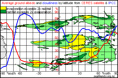
the SH due to cloudiness and ice albedo. Watch how ground albedo and cloudiness
make the SH more reflective than the NH (righthand image).
But most of the difference is found in global kinetic energy (winds) which
is roughly as expected for the NH but quite different for the SH, with
a strong peak at mid-latitudes. In the SH winter, when the contrast is
greatest, the NH summer, the kinetic energy is roughly five times greater
than the NH. For the year as a whole it is somewhere between 2 and 3.
The
tropical spiralling Hadley circulation is also a bit more complicated,
as shown here along the equator. The yellow humps are from right to left
the Andes, the Indonesian/ Papua New Guinea mountains, the African mountain
ranges and the Andes again. Over the equatorial Pacific, a text-book Hadley
circulation with its Walker component as shown here, blowing E-W over the
sea and W-E through the troposphere. On the left, the equatorial Atlantic
also follows this textbook scheme, but in-between are two opposing but
weaker cells, one over central Africa and another one over the central
Indian Ocean.
The most important fact is that rising air over the Amazon causes high
precipitation and even more so over the Indonesian archipelago where the
tropical Warm Pool is found. This large pool of warm water is capable of
producing thunderstorms with air rising to the top of the troposphere and
thereby influencing the climate everywhere as it has to come down somewhere.
the tropical Warm
Pool Consistently
warm water is found in a large area around the Indonesian archipelago and
Papua New Guinea as shown here. This is the source of most of the heat
circulation. Also shown in deep blue are the cold subpolar oceans where
the heat must go to. The Tropical Warm Pool is the only place on Earth
capable of producing deep-convective (high rising) winds, loaded with moisture,
and capable of reaching the upper troposphere and releasing its heat thus
high in the atmosphere. But it can do so only if a) ocean surface temperature
exceeds 29ºC and b) if the Warm Pool is large enough to allow this
to happen.
As
these graphs demonstrate, the size of the Warm Pool correlates well with
wind speed. Note that the Warm Pool index is easily calculated from satellite
sea surface temperatures (SST) by counting the number of 4x4 degree cells
warmer than 29 degrees C. Although there is no long-term record of the
TWP, it has been following the wind pattern since 1950 but less so between
1900-1950 for which no satellite data exists.
The
TWP is often depicted as shown here, with excursions from an 'average'.
So please note that the blue and yellow shapes are not opposites and the
curve should really have been shown as above.
But it agrees with the temperature swings found in the meteorological record:
warming between 1920 and 1940; cooling between 1940 and 1970; warming between
1970 and 2000. It is a reliable record of weather phenomena like the El
Niño/ La Niña cycle as it is based on actual sea temperature
and one of the most important drivers of global climate. It is much more
reliable than the ENSO graphs which are derived from barometric pressure
differences.
GIF
animation of the size of the Tropical Warm Pool by decade 1900-1984. This
movie shows by decade the changes in the size of the TWP. Decade by decade
it has been increasing steadily since the beginning of last century. 'Global
warming'?
These
two maps show the areas of deep convection (high rising rains), the TWP
and the Amazon basin, even though the Amazon basin does not have as much
water to evaporate. The blue low pressure areas are where most of the winds
subside, over the African desert and in oceanic doldrums (areas with little
wind).
The bottom image shows where most of Earth's heat is radiated out into
space, corresponding with rain in areas of deep convection, the rising
parts of Hadley cells. Of all these, the Tropical Warm Pool is of most
influence. It also shows that out-radiation does not happen equitably all
over the planet, but in places where it 'bursts out' due to deep convection,
thus supporting the idea that surface cooling happens by conduction, convection
and evaporation whereas in the upper troposphere infrared outradiation
begins. Thus Earth's out-radiation is not constant but subjective to changes
of 15-25% per decade and 30% per century. This process is highly sensitive
to the behaviour of winds.
Sea level We
are used to hearing alarmism based on rising sea levels as shown here on
this map based on observations from the Topex/Poseidon (T/P) satellites.
T/P flies in a groundtrack that repeats every 10-days and goes as far north
and south as 66º latitude. This means that it samples approximately
400,000 points over the ocean every 10-days.
"The global mean sea level rise observed by Topex/Poseidon amounts
to 2.5 +/- 0.2 mm/year between January 1993 and December 2000 [1]".
We are not told that it leaves a crucial part of the global sea level out
of sight, and the complete picture is quite different [2].
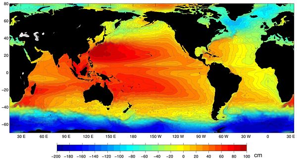
When the sea level of the whole of the world is shown, it turns out that
a deep trough of 2 metres deep (6.5 FT) surrounds Antarctica. This sea
level depression is caused by fierce winds circulating eastward and driving
a strong west to east current. Due to coriolis forces, which are strongest
near the poles, this water is pushed towards the equator where it piles
up (Ekman spiral).
Note also that a large difference exists between the east and west of the
Pacific ocean. Thus sea levels depend to a large degree on wind strength
and if there were no wind at all, the sea level would sink by 1m in the
west Pacific, 0.3m at San Diego east Pacific, and rise by 2m around Antarctica.
In the past 150 years a swing in wind strength of 30% has been observed,
leading to corresponding changes at coastal sea level stations.
It is often claimed that most (90%) of all sea level moored buoys report
a rise in sea level, which is right because all these are located in the
yellow to red areas of the map above. The other 10% are located in the
blue to green areas (but many not functioning). So we need to be very suspicious
of such claims.
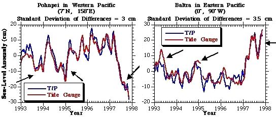
These
two graphs of sea level change, are from Pohnpei in the Western Pacific
and from Baltra in the Eastern Pacific. As you can see, they are inversely
related. When the level goes up in the east, it goes down in the west,
as can be predicted from wind strength. The blue curves are from Topex/Poseidon
satellites; the red ones from tide level gauges.
The
sea level at San Diego gives us a long-term record. From a flattish beginning
around 1910, it rose and then flattened out from 1990 on. This 0.2m rise
corresponds with the global wind pattern from the COADS dataset.
The conclusion is that short-term (decadal) and mid-term (century) fluctuations
in sea level are most likely from changes in wind speed whereas long-term
(millennia) fluctuations arise from temperature changes. We need to remain
very skeptical about popular claims and about any report using Topex/Poseidon
sea level data, particularly in the light of recently discovered fraudulent
'adjustments' [3]
[1] Cabanes, Cecile et al. (2001): Sea level rise during
past 40 years determined from satellite and in situ observations. Science
2001;294, 5543.
[2] Floor Anthoni (2010-2011): Are sea levels rising?climate4.htm#Are_sea_levels_rising [3] Sea level fraud:Analysis
finds satellite data has been continuously 'adjusted' to exaggerate sea
level rise. link
 To
investigate this, he based his research on the COADS dataset (Comprehensive
Ocean-Atmosphere Data Set) held by NOAA, to which he had access. This dataset
was begun by a far-sighted individual, Matthew Fontaine Maury (1806-1873)
who at that time headed the hydrographic office and built the sailing charts
to help mariners sail at various places around the world. He realised the
value of accumulating a dataset which would really document the behaviour
in all the oceans. So in 1854 all the participating countries agreed on
when to take observations, how to take them, how to archive them and so
on. And this has been going on now for almost 150 years up to the present,
resulting in over ten million observations which provide us with a good
documentation of just what has been happening at the ocean's surface in
all parts of the global oceans.
To
investigate this, he based his research on the COADS dataset (Comprehensive
Ocean-Atmosphere Data Set) held by NOAA, to which he had access. This dataset
was begun by a far-sighted individual, Matthew Fontaine Maury (1806-1873)
who at that time headed the hydrographic office and built the sailing charts
to help mariners sail at various places around the world. He realised the
value of accumulating a dataset which would really document the behaviour
in all the oceans. So in 1854 all the participating countries agreed on
when to take observations, how to take them, how to archive them and so
on. And this has been going on now for almost 150 years up to the present,
resulting in over ten million observations which provide us with a good
documentation of just what has been happening at the ocean's surface in
all parts of the global oceans.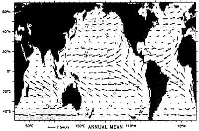 The
complexity of the climate system has been described by many people including
such great scientists as Einstein and Von Neumann, pointing out that the
ocean drives the atmosphere, and the atmosphere drives the ocean, and
that the interactions occur on all time and space scales, with nonlinearities
and thresholds and that the representation of all these interactions, are
almost beyond comprehension. The simplicity is that nature knows all the
rules, and knows all the boundary conditions and knows where the mountain
ranges are, deep ocean ridges and trenches, and the rest of the geography,
and nature's answer to that question is this average picture of winds (wind
field). When you think of it in a holistic sense, you can think, if
whatever is forcing this system, if it changes in magnitude, you can expect
that the whole pattern will wax and wane in unison. And that is exactly
what the observed record is showing as here with the wind field.
As the forcing increases, the highs become higher, the lows lower, winds
stronger, and vice versa.
The
complexity of the climate system has been described by many people including
such great scientists as Einstein and Von Neumann, pointing out that the
ocean drives the atmosphere, and the atmosphere drives the ocean, and
that the interactions occur on all time and space scales, with nonlinearities
and thresholds and that the representation of all these interactions, are
almost beyond comprehension. The simplicity is that nature knows all the
rules, and knows all the boundary conditions and knows where the mountain
ranges are, deep ocean ridges and trenches, and the rest of the geography,
and nature's answer to that question is this average picture of winds (wind
field). When you think of it in a holistic sense, you can think, if
whatever is forcing this system, if it changes in magnitude, you can expect
that the whole pattern will wax and wane in unison. And that is exactly
what the observed record is showing as here with the wind field.
As the forcing increases, the highs become higher, the lows lower, winds
stronger, and vice versa.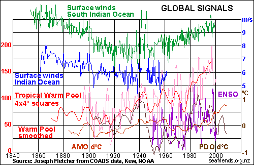 In
this graph we have brought some global signals together, that are on and
off the flavour of the time. All signals have the bottom axis as zero,
except for ENSO, AMO and PDO which are relative to the brown scale on right.
There is ENSO (El Niño Southern Oscillation) also called SOI (Southern
Oscillation Index), here the purple scribble, which is derived from a difference
in air pressure from east to west equatorial Pacific. Due to local barometric
pressure swings, it is very noisy, but related to how much water is pushed
into the Tropical Warm Pool in the west equatorial Pacific, even though
it does not swing in unison.
In
this graph we have brought some global signals together, that are on and
off the flavour of the time. All signals have the bottom axis as zero,
except for ENSO, AMO and PDO which are relative to the brown scale on right.
There is ENSO (El Niño Southern Oscillation) also called SOI (Southern
Oscillation Index), here the purple scribble, which is derived from a difference
in air pressure from east to west equatorial Pacific. Due to local barometric
pressure swings, it is very noisy, but related to how much water is pushed
into the Tropical Warm Pool in the west equatorial Pacific, even though
it does not swing in unison. 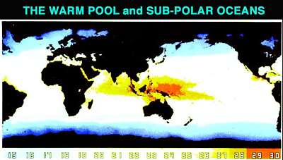 The Tropical
Warm Pool in light red, represents the pool of water warmer than 29ºC
and because of this, capable of causing thunder clouds and deep convection
into the highest reaches of the troposphere, transferring a massive amount
of latent heat into the atmosphere (see later). The red curve above is
its average, but is unreliable before 1900. Notable is the extreme rise
between 1970 and 2000 from 100 to 170 (lefthand red scale), or an unbelievable
70%, which is hard fact.
The Tropical
Warm Pool in light red, represents the pool of water warmer than 29ºC
and because of this, capable of causing thunder clouds and deep convection
into the highest reaches of the troposphere, transferring a massive amount
of latent heat into the atmosphere (see later). The red curve above is
its average, but is unreliable before 1900. Notable is the extreme rise
between 1970 and 2000 from 100 to 170 (lefthand red scale), or an unbelievable
70%, which is hard fact.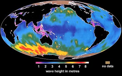 The green
squiggle in the graph above, represents the surface wind strength in the
South Indian Ocean, the world's weather power house. Winds here blow on
average at 9m/s (20MPH, 32km/h), with substantial year to year fluctuations
and a huge 150-year swing of 30%. The average wind speed over oceans is
6.5m/s with enormous geographic variation as the wave height map shows.
Remember though, that wave height is proportional to the third power of
wave wind strength. The map shows very calm areas in magenta and the Warm
Pool as poor in wind. Notice also tall waves near Canada and Greenland.
The green
squiggle in the graph above, represents the surface wind strength in the
South Indian Ocean, the world's weather power house. Winds here blow on
average at 9m/s (20MPH, 32km/h), with substantial year to year fluctuations
and a huge 150-year swing of 30%. The average wind speed over oceans is
6.5m/s with enormous geographic variation as the wave height map shows.
Remember though, that wave height is proportional to the third power of
wave wind strength. The map shows very calm areas in magenta and the Warm
Pool as poor in wind. Notice also tall waves near Canada and Greenland.
 Sea
Surface Temperature (SST) maps are usually shown in false rainbow colours,
but when their isotherms (points of equal temperature) are plotted, a picture
emerges with more information as shown here. Where these isotherms are
close together, a steep gradient exists, inviting strong winds and a highly
variable climate. Fortunately nobody lives in the Southern Ocean south
of Africa, but in the NH three areas are battered: east Canada, Japan and
west Mexico. Please note that these curves were not obtained from satellites
but from actual measurements on ships (COADS).
Sea
Surface Temperature (SST) maps are usually shown in false rainbow colours,
but when their isotherms (points of equal temperature) are plotted, a picture
emerges with more information as shown here. Where these isotherms are
close together, a steep gradient exists, inviting strong winds and a highly
variable climate. Fortunately nobody lives in the Southern Ocean south
of Africa, but in the NH three areas are battered: east Canada, Japan and
west Mexico. Please note that these curves were not obtained from satellites
but from actual measurements on ships (COADS).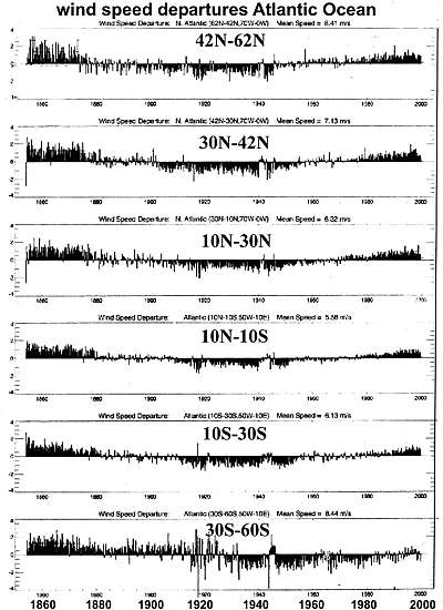
 Dr
Fletcher calculated the periodicity of the wind cycle at 170-180 years
but on 19 october 2012 a massive dust storm over central USA reminded us
of the "Black Sunday" dust storm of 14 April 1935, suggesting a periodicity
of 77 years (about half of 150), and a repeat of the "dust bowl" droughts
of the 1930s with severe loss of topsoil and harvests, for years
to come.This occurs just as a large part of the corn harvest is diverted
to ethanol production.Note that another recent dust storm happened in Arizona
on 5 July 2011.
Dr
Fletcher calculated the periodicity of the wind cycle at 170-180 years
but on 19 october 2012 a massive dust storm over central USA reminded us
of the "Black Sunday" dust storm of 14 April 1935, suggesting a periodicity
of 77 years (about half of 150), and a repeat of the "dust bowl" droughts
of the 1930s with severe loss of topsoil and harvests, for years
to come.This occurs just as a large part of the corn harvest is diverted
to ethanol production.Note that another recent dust storm happened in Arizona
on 5 July 2011.
 There
exists as yet no reliable method to measure past fluctuations in sunlight
arriving at Earth's surface, even though the new radioactive Beryllium-10
method looks promising [1]. The very light metal Beryllium occurs
in the atmosphere as it is created from cosmic bombardment of larger molecules
like nitrogen. As it dissolves in rain drops, it settles out on Earth's
surface where it gets enclosed in ice and sediments. But the technique
is young, its signal small and its interpretation uncertain. In the graph
(Beer et al. 1994) is also shown the sunspot activity (Hoyt and Schatten
1998), which in 1650-1750 caused deep cold (the Maunder Minimum or Little
Ice Age). A new minimum after 2010, appears to be coming. Note that these
curves are not in agreement with the wind pattern.
There
exists as yet no reliable method to measure past fluctuations in sunlight
arriving at Earth's surface, even though the new radioactive Beryllium-10
method looks promising [1]. The very light metal Beryllium occurs
in the atmosphere as it is created from cosmic bombardment of larger molecules
like nitrogen. As it dissolves in rain drops, it settles out on Earth's
surface where it gets enclosed in ice and sediments. But the technique
is young, its signal small and its interpretation uncertain. In the graph
(Beer et al. 1994) is also shown the sunspot activity (Hoyt and Schatten
1998), which in 1650-1750 caused deep cold (the Maunder Minimum or Little
Ice Age). A new minimum after 2010, appears to be coming. Note that these
curves are not in agreement with the wind pattern.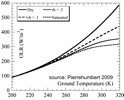 Some
support for the notion of reduced Outgoing Longwave Radiation OLR comes
from a computer model by Pierrehumbert, the results of which are graphed
here. Horizontally the temperature of the surface in Kelvin, and vertically
the outgoing IR radiation. rh means relative humidity. The top solid black
line treats the surface as if it were a black body, radiating out according
to the Stefan-Boltzman equation. If the air contains moisture, OLR reduces
because water vapour absorbs OLR. The more water vapour, the less OLR.
Note that 273K is 0ºC and the Warm Pool of above 29ºC is to the
right of 302K. Here moisture can make a 30% difference, supporting the
notion that increased winds, cause increased evaporation, causes less OLR
and more warming of air. Thus OLR can vary considerably over time and place,
and is definitely not constant. In theory, changes of up to 30% can even
happen on a yearly basis, but is not likely. Smaller yearly changes become
more likely.
Some
support for the notion of reduced Outgoing Longwave Radiation OLR comes
from a computer model by Pierrehumbert, the results of which are graphed
here. Horizontally the temperature of the surface in Kelvin, and vertically
the outgoing IR radiation. rh means relative humidity. The top solid black
line treats the surface as if it were a black body, radiating out according
to the Stefan-Boltzman equation. If the air contains moisture, OLR reduces
because water vapour absorbs OLR. The more water vapour, the less OLR.
Note that 273K is 0ºC and the Warm Pool of above 29ºC is to the
right of 302K. Here moisture can make a 30% difference, supporting the
notion that increased winds, cause increased evaporation, causes less OLR
and more warming of air. Thus OLR can vary considerably over time and place,
and is definitely not constant. In theory, changes of up to 30% can even
happen on a yearly basis, but is not likely. Smaller yearly changes become
more likely.
 Here
the global climate zones are shown in colours from left North Pole to right
South Pole. Superimposed are temperature curves for the northern summer
(red), average (green) and the southern summer (blue). Although both hemispheres
behave quite similarly, it can be seen that the NH warms up in summer more
so than the SH, while also becoming colder in winter, even though average
temperatures are quite similar. In simple terms, the NH has a land climate
(more extreme) and the SH a sea climate (more equitable).
Here
the global climate zones are shown in colours from left North Pole to right
South Pole. Superimposed are temperature curves for the northern summer
(red), average (green) and the southern summer (blue). Although both hemispheres
behave quite similarly, it can be seen that the NH warms up in summer more
so than the SH, while also becoming colder in winter, even though average
temperatures are quite similar. In simple terms, the NH has a land climate
(more extreme) and the SH a sea climate (more equitable).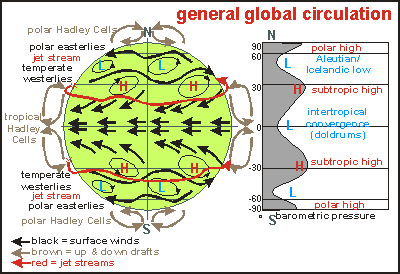 This
diagram simplifies global atmospheric circulation as if it were symmetrical
for both hemispheres. Around the equator, trade winds blowing E to W converge
to a weak equatorial E-W flow and corresponding ocean currents (ITC= Inter
Tropical Convergence). The convergence (clash of winds) causes air to rise,
releasing heavy rain, travelling poleward and descending in the subtropic
highs as very cool dry air, creating the desert zones of the planet. This
is called the tropical Hadley circulation which spirals E to W around both
sides of the equator. There is a counter flow in the upper troposphere
in the form of jet streams. In the temperate climate zone, winds are dominated
by the Coriolis force which deflects to the right on the NH and to the
left on the SH. The winds here are mainly westerlies and they are very
strong. Finally around the poles exist the polar Hadley cells, with strong
winds spiralling around the poles in an E-W direction. We will now see
that this narrative is not true in the real world.
This
diagram simplifies global atmospheric circulation as if it were symmetrical
for both hemispheres. Around the equator, trade winds blowing E to W converge
to a weak equatorial E-W flow and corresponding ocean currents (ITC= Inter
Tropical Convergence). The convergence (clash of winds) causes air to rise,
releasing heavy rain, travelling poleward and descending in the subtropic
highs as very cool dry air, creating the desert zones of the planet. This
is called the tropical Hadley circulation which spirals E to W around both
sides of the equator. There is a counter flow in the upper troposphere
in the form of jet streams. In the temperate climate zone, winds are dominated
by the Coriolis force which deflects to the right on the NH and to the
left on the SH. The winds here are mainly westerlies and they are very
strong. Finally around the poles exist the polar Hadley cells, with strong
winds spiralling around the poles in an E-W direction. We will now see
that this narrative is not true in the real world.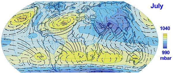
 The
map shows where people live, and their densities. It also shows the extent
of the Inter Tropical Convergence zone which travels from the July curve
(northern summer, red) to the January curve (northern winter, blue) and
back each year, with variations in its extent. Where winds meet, air rises,
causing rain. The ITC is essentially a rain band, which means that the
people living between red and blue bands, experience two rainy seasons
each year, which is most beneficial for agriculture and thus for humanity.
About half the world's population lives here (dark colour).
The
map shows where people live, and their densities. It also shows the extent
of the Inter Tropical Convergence zone which travels from the July curve
(northern summer, red) to the January curve (northern winter, blue) and
back each year, with variations in its extent. Where winds meet, air rises,
causing rain. The ITC is essentially a rain band, which means that the
people living between red and blue bands, experience two rainy seasons
each year, which is most beneficial for agriculture and thus for humanity.
About half the world's population lives here (dark colour). 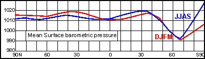 Looking
at average barometric pressure, a huge difference is found between the
two hemispheres. The graph shows how the northern winter and summer do
not differ very much but south of 40ºS, barometric pressure tumbles
into a consistent ever-present deep Antarctic low. This steep gradient
forms perhaps the motor of the world's climate system, with very strong
winds unobstructed by mountain ranges..
Looking
at average barometric pressure, a huge difference is found between the
two hemispheres. The graph shows how the northern winter and summer do
not differ very much but south of 40ºS, barometric pressure tumbles
into a consistent ever-present deep Antarctic low. This steep gradient
forms perhaps the motor of the world's climate system, with very strong
winds unobstructed by mountain ranges..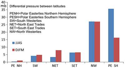 When
the above barometric pressure is plotted as differential pressure between
latitudes, it looks like this bar chart, the blue bars for the NH summer
and the red bars for winter. The differences in barometric pressure, or
the gradient in pressure, is what drives the winds. As one can see, the
Southern Hemisphere has a huge wind field compared to the Northern Hemisphere.
Strongest winds occur around Antarctica in the southern winter JJAS.
When
the above barometric pressure is plotted as differential pressure between
latitudes, it looks like this bar chart, the blue bars for the NH summer
and the red bars for winter. The differences in barometric pressure, or
the gradient in pressure, is what drives the winds. As one can see, the
Southern Hemisphere has a huge wind field compared to the Northern Hemisphere.
Strongest winds occur around Antarctica in the southern winter JJAS.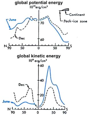
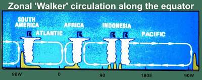 The
tropical spiralling Hadley circulation is also a bit more complicated,
as shown here along the equator. The yellow humps are from right to left
the Andes, the Indonesian/ Papua New Guinea mountains, the African mountain
ranges and the Andes again. Over the equatorial Pacific, a text-book Hadley
circulation with its Walker component as shown here, blowing E-W over the
sea and W-E through the troposphere. On the left, the equatorial Atlantic
also follows this textbook scheme, but in-between are two opposing but
weaker cells, one over central Africa and another one over the central
Indian Ocean.
The
tropical spiralling Hadley circulation is also a bit more complicated,
as shown here along the equator. The yellow humps are from right to left
the Andes, the Indonesian/ Papua New Guinea mountains, the African mountain
ranges and the Andes again. Over the equatorial Pacific, a text-book Hadley
circulation with its Walker component as shown here, blowing E-W over the
sea and W-E through the troposphere. On the left, the equatorial Atlantic
also follows this textbook scheme, but in-between are two opposing but
weaker cells, one over central Africa and another one over the central
Indian Ocean.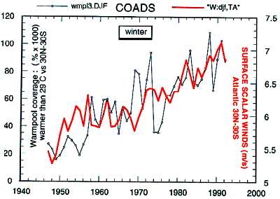 As
these graphs demonstrate, the size of the Warm Pool correlates well with
wind speed. Note that the Warm Pool index is easily calculated from satellite
sea surface temperatures (SST) by counting the number of 4x4 degree cells
warmer than 29 degrees C. Although there is no long-term record of the
TWP, it has been following the wind pattern since 1950 but less so between
1900-1950 for which no satellite data exists.
As
these graphs demonstrate, the size of the Warm Pool correlates well with
wind speed. Note that the Warm Pool index is easily calculated from satellite
sea surface temperatures (SST) by counting the number of 4x4 degree cells
warmer than 29 degrees C. Although there is no long-term record of the
TWP, it has been following the wind pattern since 1950 but less so between
1900-1950 for which no satellite data exists. The
TWP is often depicted as shown here, with excursions from an 'average'.
So please note that the blue and yellow shapes are not opposites and the
curve should really have been shown as
The
TWP is often depicted as shown here, with excursions from an 'average'.
So please note that the blue and yellow shapes are not opposites and the
curve should really have been shown as  GIF
animation of the size of the Tropical Warm Pool by decade 1900-1984. This
movie shows by decade the changes in the size of the TWP. Decade by decade
it has been increasing steadily since the beginning of last century. 'Global
warming'?
GIF
animation of the size of the Tropical Warm Pool by decade 1900-1984. This
movie shows by decade the changes in the size of the TWP. Decade by decade
it has been increasing steadily since the beginning of last century. 'Global
warming'?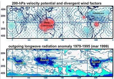 These
two maps show the areas of deep convection (high rising rains), the TWP
and the Amazon basin, even though the Amazon basin does not have as much
water to evaporate. The blue low pressure areas are where most of the winds
subside, over the African desert and in oceanic doldrums (areas with little
wind).
These
two maps show the areas of deep convection (high rising rains), the TWP
and the Amazon basin, even though the Amazon basin does not have as much
water to evaporate. The blue low pressure areas are where most of the winds
subside, over the African desert and in oceanic doldrums (areas with little
wind).
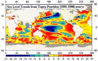 We
are used to hearing alarmism based on rising sea levels as shown here on
this map based on observations from the Topex/Poseidon (T/P) satellites.
T/P flies in a groundtrack that repeats every 10-days and goes as far north
and south as 66º latitude. This means that it samples approximately
400,000 points over the ocean every 10-days.
We
are used to hearing alarmism based on rising sea levels as shown here on
this map based on observations from the Topex/Poseidon (T/P) satellites.
T/P flies in a groundtrack that repeats every 10-days and goes as far north
and south as 66º latitude. This means that it samples approximately
400,000 points over the ocean every 10-days.
 These
two graphs of sea level change, are from Pohnpei in the Western Pacific
and from Baltra in the Eastern Pacific. As you can see, they are inversely
related. When the level goes up in the east, it goes down in the west,
as can be predicted from wind strength. The blue curves are from Topex/Poseidon
satellites; the red ones from tide level gauges.
These
two graphs of sea level change, are from Pohnpei in the Western Pacific
and from Baltra in the Eastern Pacific. As you can see, they are inversely
related. When the level goes up in the east, it goes down in the west,
as can be predicted from wind strength. The blue curves are from Topex/Poseidon
satellites; the red ones from tide level gauges.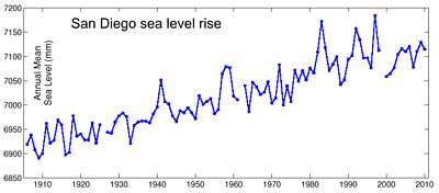 The
sea level at San Diego gives us a long-term record. From a flattish beginning
around 1910, it rose and then flattened out from 1990 on. This 0.2m rise
corresponds with the global wind pattern from the COADS dataset.
The
sea level at San Diego gives us a long-term record. From a flattish beginning
around 1910, it rose and then flattened out from 1990 on. This 0.2m rise
corresponds with the global wind pattern from the COADS dataset.